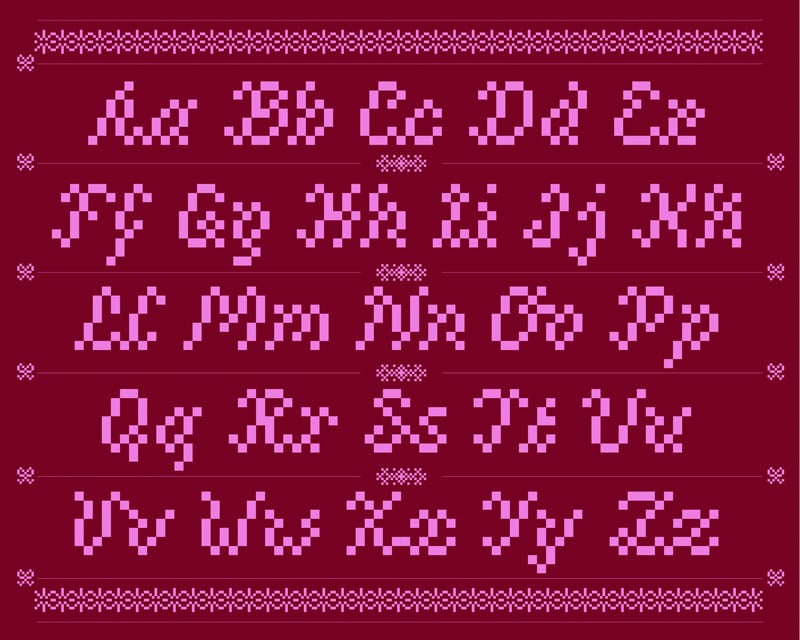
Agathe Millet: Hardanger (Copyright © Agathe Millet, 2024)
If you said the word Hardanger to someone, they might follow up with the question, "Hardanger, what?" The word is associated with various things well-known and loved by Norwegians. One of its most well-known associations is with embroidery.
Hardangersøm, what in English is known as Hardanger-style embroidery, is thought to perhaps have originated in Persia or Asia and eventually made its way to Europe where it flourished in Norway for 200 years, starting in 1650. It continues to be prominent in Norwegian culture, including its featured use in the bunad of the same-named region.
Hardanger embroidery uses white thread on an even-weave cloth material, often linen, of the same color. Because of this, the craft is sometimes also known as "whitework." Contemporary forms of the embroidery may use color combinations and contrasts in the thread or fabric base. As with many other specialty crafts, Hardanger continues to grow and evolve.
Because of the symmetrical nature of Hardanger, it lends itself to a new use – as a font. Graphic designer Agathe Millet spent a year in Norway as an exchange student and was inspired by the Hardanger embroidery style. That inspiration eventually led her to create a vintage style 8-bit font named Hardanger over the course of two years. Considerable time, effort and study went into the creation of this typeface as Millet needed to study the craft itself to be able to capture its signature style in a digital format.
The font is retro in style, tying together a traditional artistic craft with contemporary digital design. The versatile typeface was envisioned by its creator to be used as a display font that could be utilized in headings, text and overlays. Three different variants of the font were created to add to its versatility.
Miller wanted the finished product to feel like a large piece of embroidery, which she has achieved in this beautiful new font design.
Sources:
